
Color Palette

Rules of Color
Color can evoke emotions and influence the mindset of the learner. Green is often associated with invoking concentration and focus, blue with having a calming effect and increasing productivity, orange with a friendly, uplifting environment. While drawing on the psychology of color is one aspect of decision making, the overriding rule in color selection is to use colors that compliment the visual image that communicates the theme of the digital space.
That said, color should be aesthetically used for visual emphasis and to improve clarity of symbols used to communicate. Limiting complementary colors to one is preferable, with a second complementary color (often black or white) leveraged to increase clarity and highlight the vision and creativity communicated through the blend of image and color.
Example
The image below is used for an online undergraduate course in critical thinking and composition. Black is used to give definition and highlight the primary color blue and the aesthetic created from its interplay with white. White serves as both the main accent color as well as a color that improves readability with the small amount of negative text (larger amounts of white text on black would decrease readability and so should be avoided in these cases).
The color blue is also often associated with a calming effect, which can be a psychologically effective color choice to improve learning in a course that deals with complicated, abstract concepts like a critical thinking course does. The implication is that difficulty or hard to grasp material can hightened anxiety and stress, which can impede cognitive processing. A calming color such as blue is responsive to this experience.

Color Combinations
My process of image and color selection over the years have produced certain color combinations worth noting and reusing for future projects.
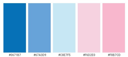
Blues & Pinks
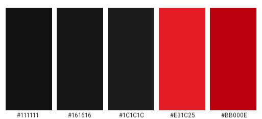
Blacks & Reds
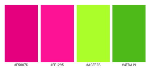
Greens & Pinks
Greens & Yellows

Browns and Oranges

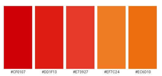
Reds and Oranges
Blacks and Whites

References
Hagen, R., & Golombisky, K. (2017). "Chapter 8: Color Basics." White Space is Not Your Enemy: A Beginner’s Guide to Communicating Visually Through Graphic, Web & Multimedia Design (3rd ed.). A K Peters/CRC Press.
6 Ways Color Psychology Can Be Used to Design Effective eLearning. Shift. https://www.shiftelearning.com/blog/bid/348188/6-ways-color-psychology-can-be-used-to-design-effective-elearning.
The Psychology of Color: How do Colors Influence Learning?" Shift. https://www.shiftelearning.com/blog/bid/348188/6-ways-color-psychology-can-be-used-to-design-effective-elearning.